How can we organize, maintain and present an enormous amount of information in a way that makes sense for users?
My Role: UX Designer
Tools Used: Adobe XD, Illustrator, PowerPoint
One of the biggest challenges of being a major international corporation supporting a broad range of products and services is to maintain a repository of the licensing terms required for each individual product and service. These terms take the form of long legal documents which are costly to store and inefficient to update.
The Problem
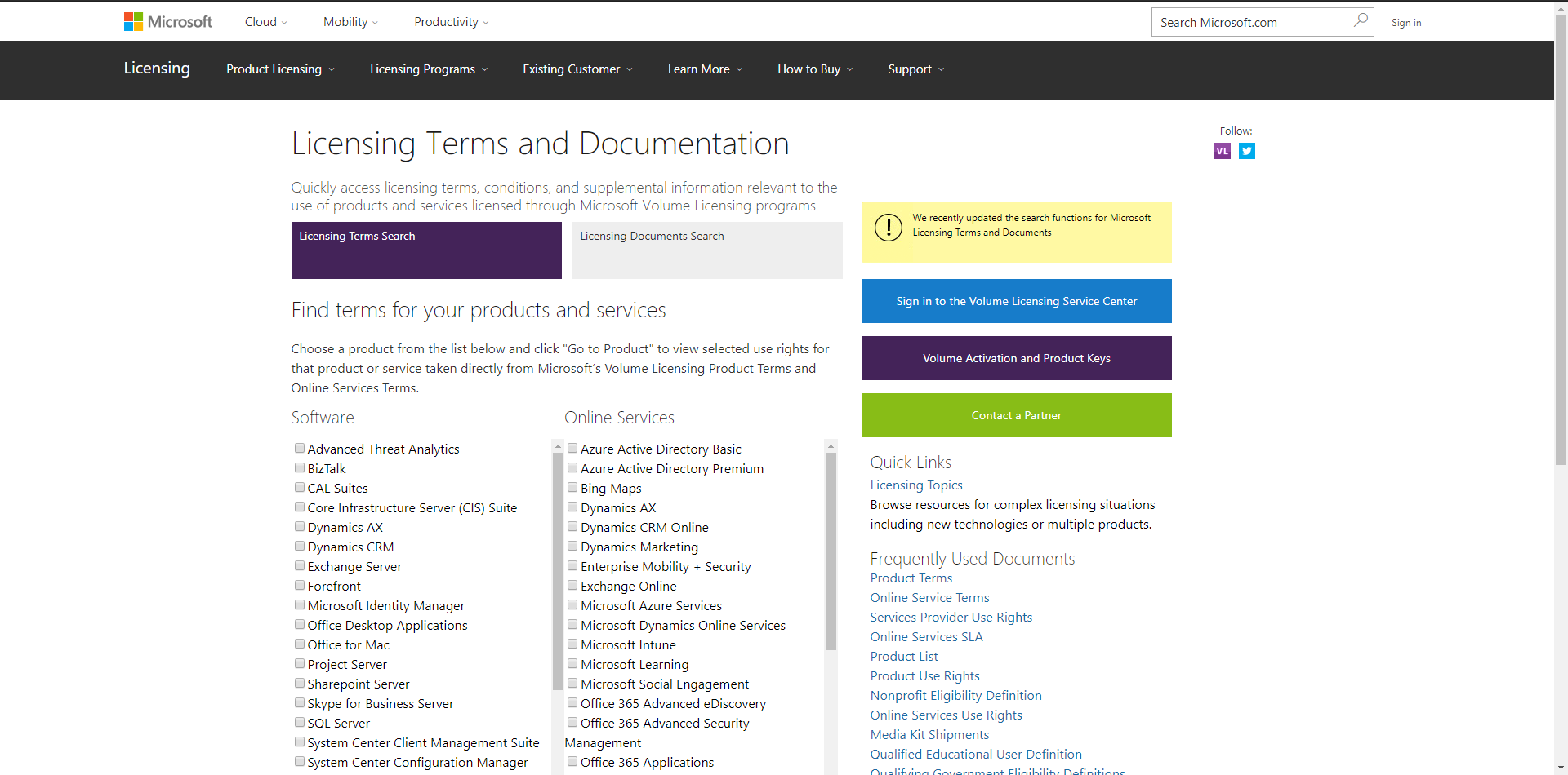
Up until contracting my company, our client (Microsoft Volume Licensing) had been handling the issue in an unplanned manner, incurring a significant expense to keep and update an outside database full of long, text-heavy documents covering over 400 individual SKUs. Multiply that by nearly a dozen different licensing programs and the complexity was overwhelming.
In addition, a large cross-section of the individual terms overlapped between files, meaning much of the expense could be saved if we developed a way to store each individual clause from every document and serve them up as needed to the end user.
The final requirement came courtesy of a need to merge the ocmpany’s volume licensing site, kept separate for administrative reasons for years, into the main microsoft.com domain. This was seen as an opportunity to revisit the informational architecture of both sites and find a unified structure for them.
The Research
I interviewed key stakeholders including members of the team responsible for storing and updating the license terms, and sat in on sessions to observe current volume licensing customers use the existing site.
I ran a series of card sorts to help define clearer, more intuitive categorization for the client’s vast product catalog. The end result condensed the list of product more than 30% by allowing us to group together overlapping license terms.
I was able to draw a number of conclusions on how to enable the most common and useful functions of the site, such as:
- Refining and simplifying the overall hierarchy of their product offerings to enable easy browsing
- Allowing users to “filter” the terms by applicable product SKU, as well as the licensing program under which a product might fall
- Simplifying the back-end CMS used to update the licensing terms, especially with respect to bulk editing of multiple-language documents
The Architecture
I plugged the new terms architecture into the larger IA of the site, which included marketing information about much of the services on offer and would be rewritten to link back into the new site architecture once implementation was complete. Front-end structures for both the main microsoft.com domain and the microsoftvolumelicensing.com domain were merged and overlapping links refined.
The front- and back-end sites would be separate structures accessing the same database; no overlap was required beyond using the same hierarchy for products and tagging for terms.
Wireframes and Comps
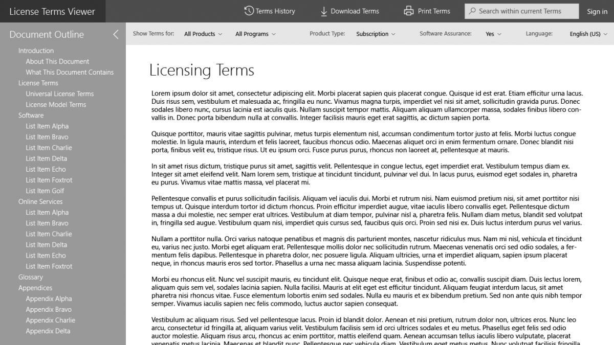
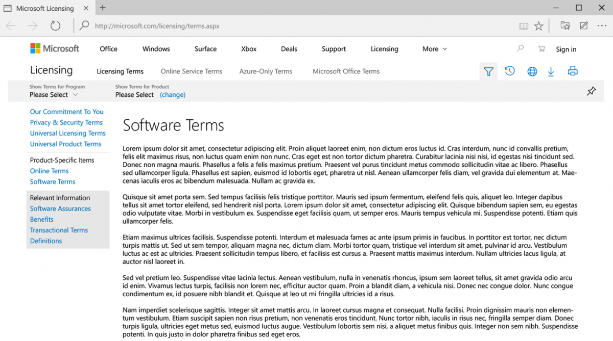
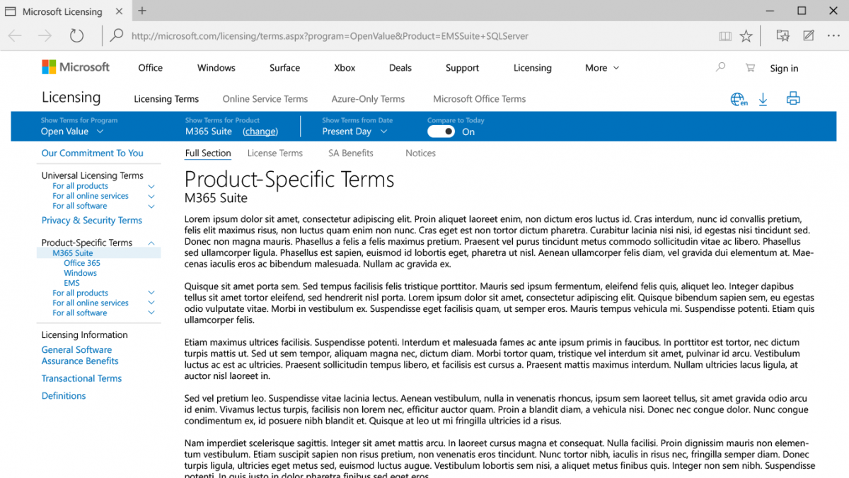
I started creating wireframes for the front- and back-end UIs, but quickly moved on to more high-fidelity comps since the client already had established a strong web style guide for me to work within.
Many of my initial assumptions about how the licensing terms worked together as a single document were soon proven wrong, and further research was needed to refine the organization of the terms into a body of knowledge that both was and was not a single document.
Front-End Website
The customer-facing portion of the site would be focused on helping the user search, browse, filter and scope the full body of terms as if it were one master document
Back-End CMS
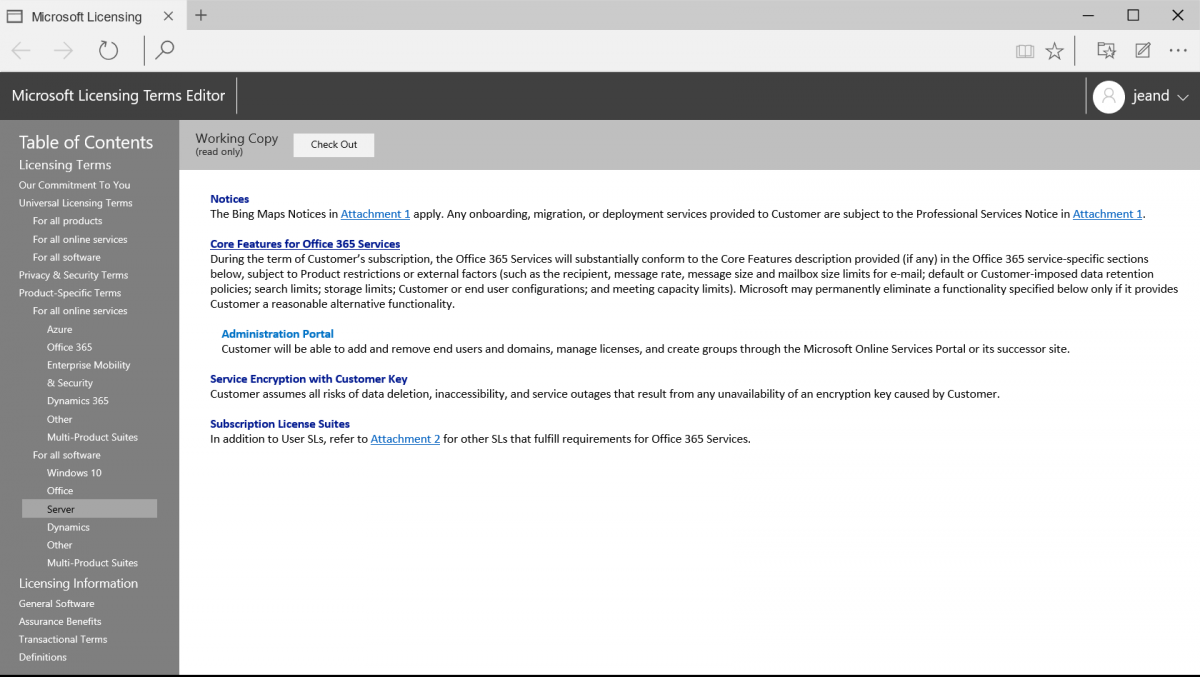
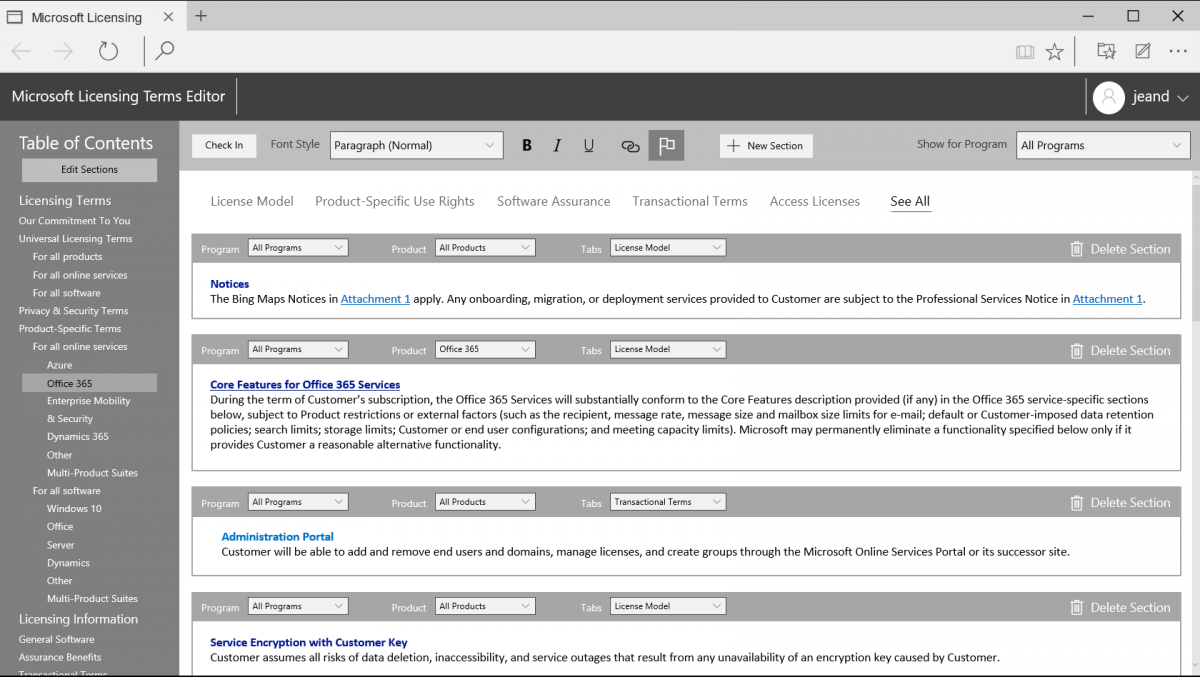
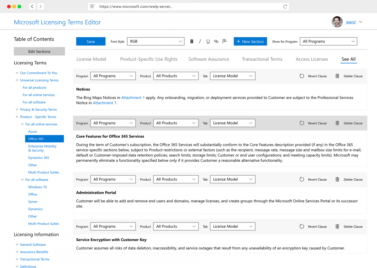
The back-end CMS would focus on the writing, updating, storage, and organization of the product terms. To accommodate the new paradigm of individual clauses being grouped and served together, the new CMS had to keep a large volume of clauses — text paragraphs in the database — associated with Programs, Products, Document Types, and
My focus here was to require as few repetitive actions as possible from anyone trying to update any documents. This was particularly important because every word in the database had to be updated 35 times into different supported languages, adding significantly to labor costs within the org.
The Handoff
Once my designs were singed off on by the client, I handed them off to a pair of Visual Designers (Karl Juridico for the front-end, Jonathan Octobre for the CMS) responsible for cleaning up any alignment or styling issues, making sure the whole design remained within the specifications set forth in the client’s style guide, and exporting the results to a Zeplin file to forward on to a build team.
The Results
The development stage of the project is still underway as of November 2018, but if everything goes as projected, it should be finished Q1 2019. As planned, the project should:
- Save thousands of dollars a month over the server costs required by the previous solution
- Conserve user resources by reducing unnecessary bloat in downloads and printed pages
- Provide a base to integrate the existing site into the main company domain for greater visibility