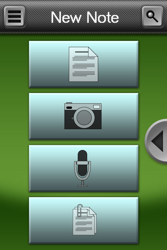
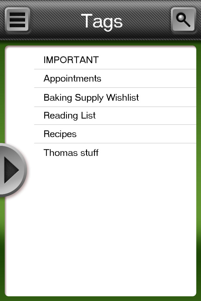
In 2011, the note-taking app Evernote raised a large round of funding to push ahead with plans to redesign the (at the time) lackluster GUI of their mobile app. As a fan of the app (but not the interface at the time) I took the opportunity to create my own idea of the UI. Though just a personal project, I found once Evernote released their new app there was a satisfying number of design choices that had overlapped between myself and Evernote’s design team, such as the sliding lists and large pictograph buttons for the all-important functionality of new notes.