How can we streamline a system of interconnected processes?
My Role: UX Design Lead
Tools Used: Adobe XD, Illustrator, PowerPoint
Providing niche specialty services, especially those which require human intervention in a significant number of cases, can require a large, complex series of actions and processes to be assembled into a coherent system. The software underlying these human-computer interactions can make or break the business
The Problem
The client’s business revolves around a very specific service: reviewing merchant accounts on behalf of the world’s largest credit card processors (including VISA, Mastercard, Discover and American Express) for compliance with their codes of conduct as well as laws and regulations in the countries in which they operate.
The client had been using a proprietary tool to automatically sort, classify, and grade each site page-by-page; potentially offending results were funneled to human auditors who would review websites rapidly to determine if the system flagged something genuinely offending or not. The proprietary tool was aging, though, and in need of a serious update.
The Research
The project revolved around two main experiences:
- That of customers who would be logging into a dashboard to upload spreadsheets of new merchants and download resulting reports that recommended which accounts to keep and which to terminate
- That of the auditing employees of the client, who would be using the tool as part of their day-to-day work
Each had differing needs and issues; in order to better pin down what would be needed I established research groups, one for internal users that I would meet with to regularly solicit feedback and ask questions on their individual experiences, and another composed of current and former employees of client companies who had worked with the existing tool from the external perspective.
Using live and simulated data, I observed each in live studies performing basic tasks in the software and began zeroing in on the pain points that were creating the most trouble for internal as well as external users. Among other things, poor information architecture and undifferentiated walls of text were making it difficult to navigate and find information.
The Architecture
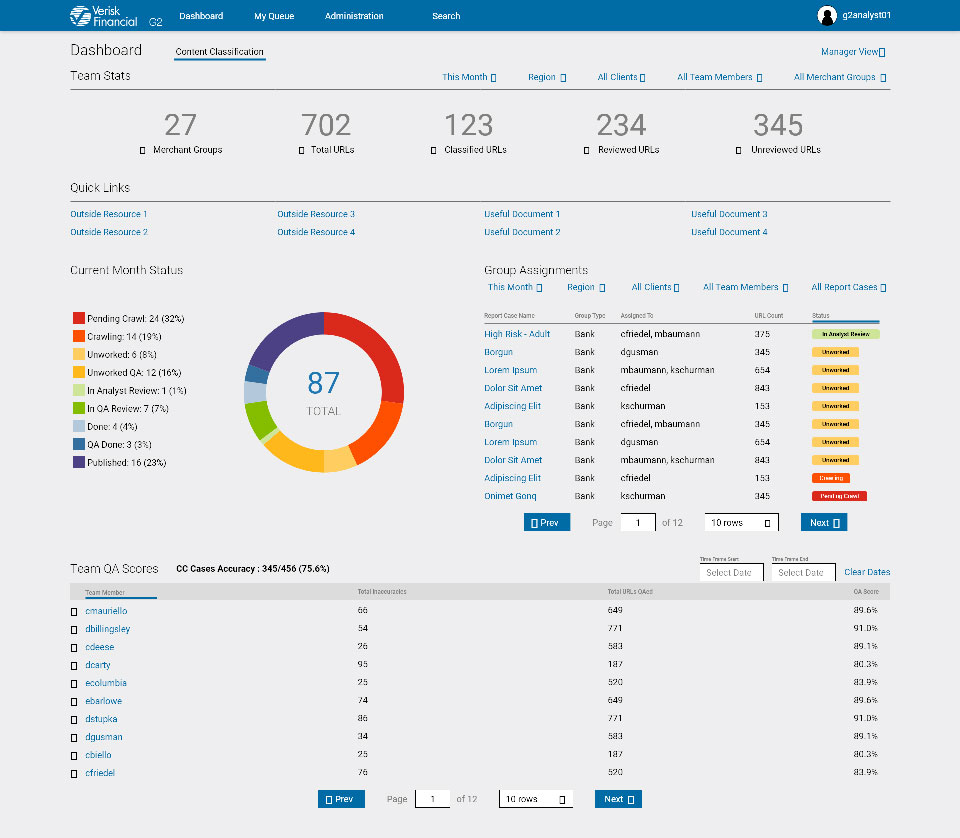
Working to an ideal of stripped down efficiency, every facet of navigation was changed to require fewer clicks to navigate between the most commonly used portions of the auditor web app in order to minimize cognitive load when context switching. Progressive disclosure was applied where possible to avoid overloading interfaces any more than necessary, and dashboards used by clients and supervisors incorporated charts and visuals to help explain the information without creating more clutter.
Wireframes and Mockups
Wireframes began as hand drawings, progressed to simple layouts built in Adobe XD, and iteratively evolved into high-fidelity mockups and working prototypes of the end product, shown at each stage to relevant stakeholders as well as members of the test groups to ensure that our focus remained on the actual needs of users.
The Handoff
I worked with a team of developers to ensure that the designs were faithfully translated into HTML and CSS, utilizing Confluence to build a Design System for devs and subsequent designers to reference and connecting the designs linked in Adobe XD to code snippets in Storybook and specs from Zeppelin.
Upon completion of development for any segment of the product, I would run a series of user tests to confirm the success of design improvements, as well as ensure that everything matched up between the design and live product.
The Results
The immediate results were somewhat superficial: users praised the updated visual design, simplified typography, or responsiveness of the layout on their tablet screens. However, as time went on, the average amount of time each site had to be audited — the primary KPI for the business on the Internal side — was cut by over 60% from over 90 seconds to around 40 seconds.
On the External side of the web app, user complaints dropped by 25%, and calls to the help desk to assist users with operating the tool in particular made up nearly 75% of the decrease.