My Role: UI Designer
Tools Used: Adobe Illustrator, Adobe XD
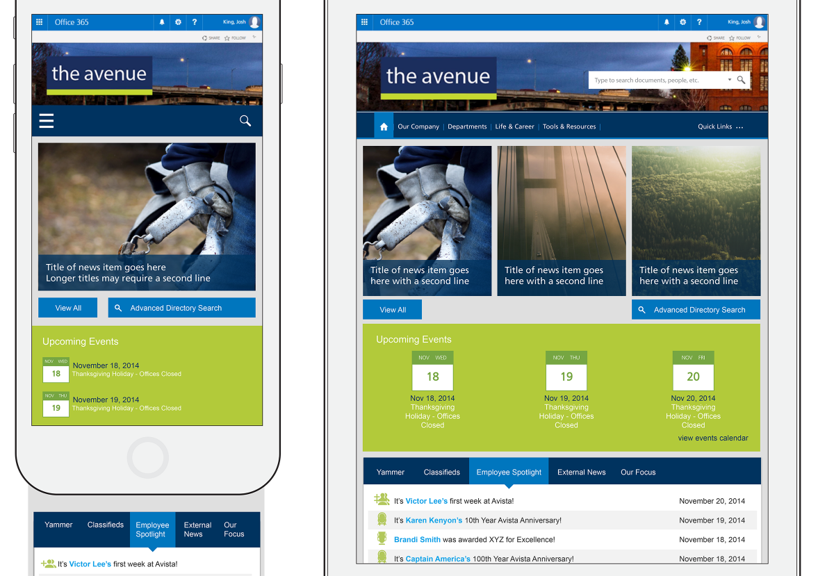
Designing a mobile and tablet interface based on an existing Desktop design
When Washington-based power company Avista originally contracted with Affirma Consulting, they only had a budget for a non-responsive desktop-first web design for their new internal SharePoint. Years later, however, they came back asking us to come up with a mobile- and tablet-friendly addition to our original designs.
Specifically, they wanted to keep their desktop look and feel, but wanted us to take it and create new adaptive versions of the designs for tablet and mobile breakpoints. I was tasked with taking the original desktop design and re-configuring it to meet the needs of the other two platforms.
Approach

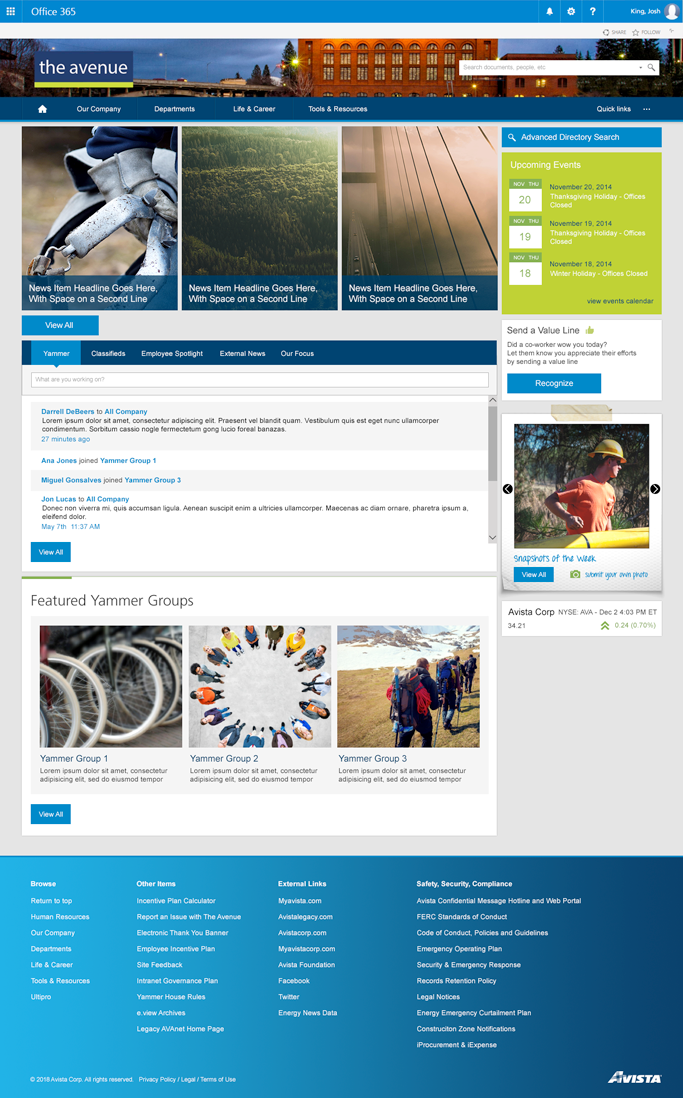
I began by taking the content of the existing site and organizing it into groups not only by the type of content being displayed, but the order in which it appears in the page. This gave me a basis on which to build modified pages.
Fortunately, SharePoint is already designed to be modular for easy maintenance, so I was able to take each module and resize the elements within in order to make them friendlier to each breakpoint size. this included changing the size of fonts, layouts and spacing, and making the interaction targets bigger to account for fingertips instead of mouse cursors.
Results
Once I had the order down, and the resized elements, I could recombine them into each page’s new adaptive designs.


