My Role: Principal UX Designer
Tools Used: Adobe Illustrator, Photoshop
The Concept
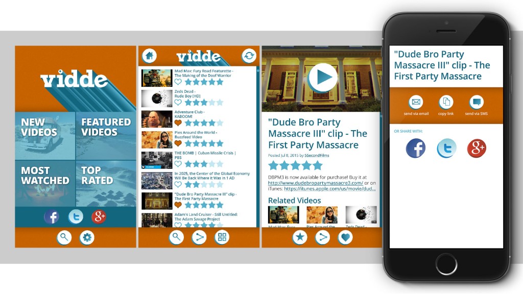
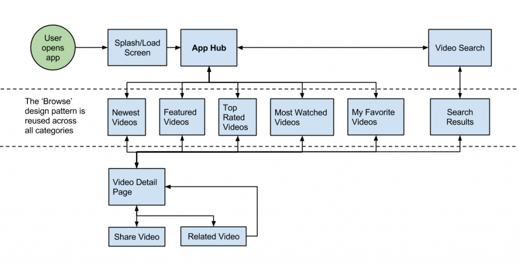
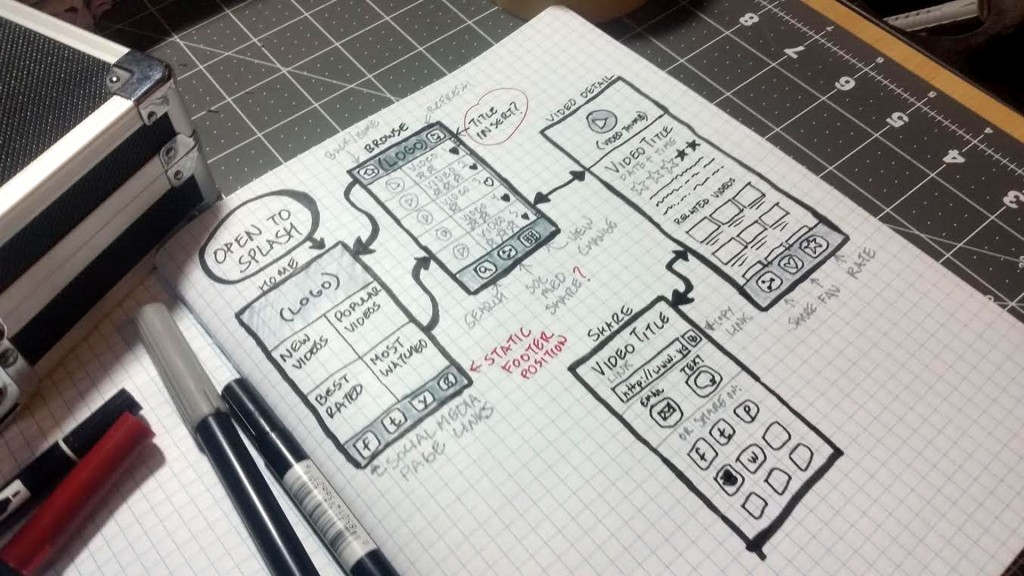
The Vidde mobile app is a platform for curated video content, intended for use on iOS and Android devices with potential for a Windows Phone port in the future. More accurately, Vidde is a simple framework for featuring videos from a variety of sources.
Requirements
The app had three primary requirements from stakeholders:
- Help users find videos through curation and search
- Allow users to rate and favorite videos
- Facilitate video sharing on social media
Each could be broken down into pertinent user stories from there. I like to stick to the effective — if idiosyncratic — standard of “as a ____, I can _____” user stories, which in my experience helps keep the UX process firmly centered on the User.
- Help users find videos through curation and search
- As a User, I can search videos by keyword or date
- As a User, I can browse content by date, rating, or number of views
- As a User, I can view video content
- Allow users to rate and favorite videos
- As a User, I can see the current rating of a video
- As a User, I can rate videos
- As a User, I can add videos to my favorites list
- As a user, I can view my Favorites list (implied)
- Facilitate video sharing on social media
- As a User, I can Like or share videos on Facebook
- As a User, I can share videos to Twitter
- As a User, I can +1 or share videos to my Google+ page
- As a User, I can share videos via email
- As a User, I can share videos via SMS
- As a User, I can copy a video’s URL to share directly
Workflow
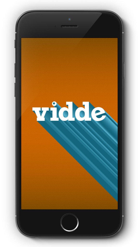
It’s important to decide on the macro structure of the app first, to help flesh out the basic experience early on instead of after the UI design has begun.
The decision was made early on to keep the app architecture simple, so that nowhere within the app required more than a handful of taps to access from anywhere else on the site
Brand & Styling
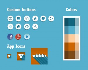
The color scheme was chosen the the stakeholders from a pool of ideas put forth by the design team. The themes at the forefront of the decision making process were “bright,” to help create a cheerful atmosphere, and “quirky,” to appeal to a younger, savvy users in a way that doesn’t alienate their older or less technically-inclined peers.
Sketches
Armed with my collected information, I took to my sketchbook to being connecting the information dots necessary to create a fully functioning UI. I find that hand-drawing first helps solidify ideas and rapidly correct errors.
This is also a great time to solicit feedback, as major changes will only get harder from this point on.
Wireframes
Building upon the rough sketches, I used Balsamiq Mockups to refine and polish the UI layout, giving a more formalized idea of the final product for the stakeholders to approve as well as for the first stages of prototyping by the development team.
Color Mockups
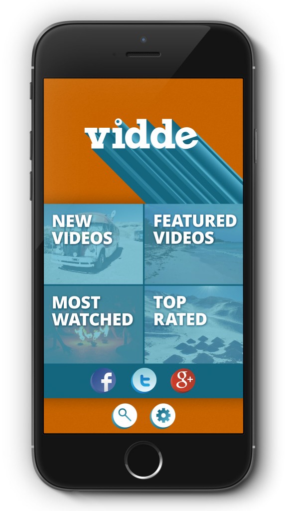
My final deliverable, these mockups take the approved layout and the approved color scheme and bring the two together in the final plan for the look and feel of the product.
