How can daily commutes be improved by a mobile experience?
My Role: UX and Visual Designer
The mobile web has a tremendous ability to improve the experience of commuters — that’s the core idea behind WhichRoute, an app which aims to encourage the user to take their ideal path to their destination.
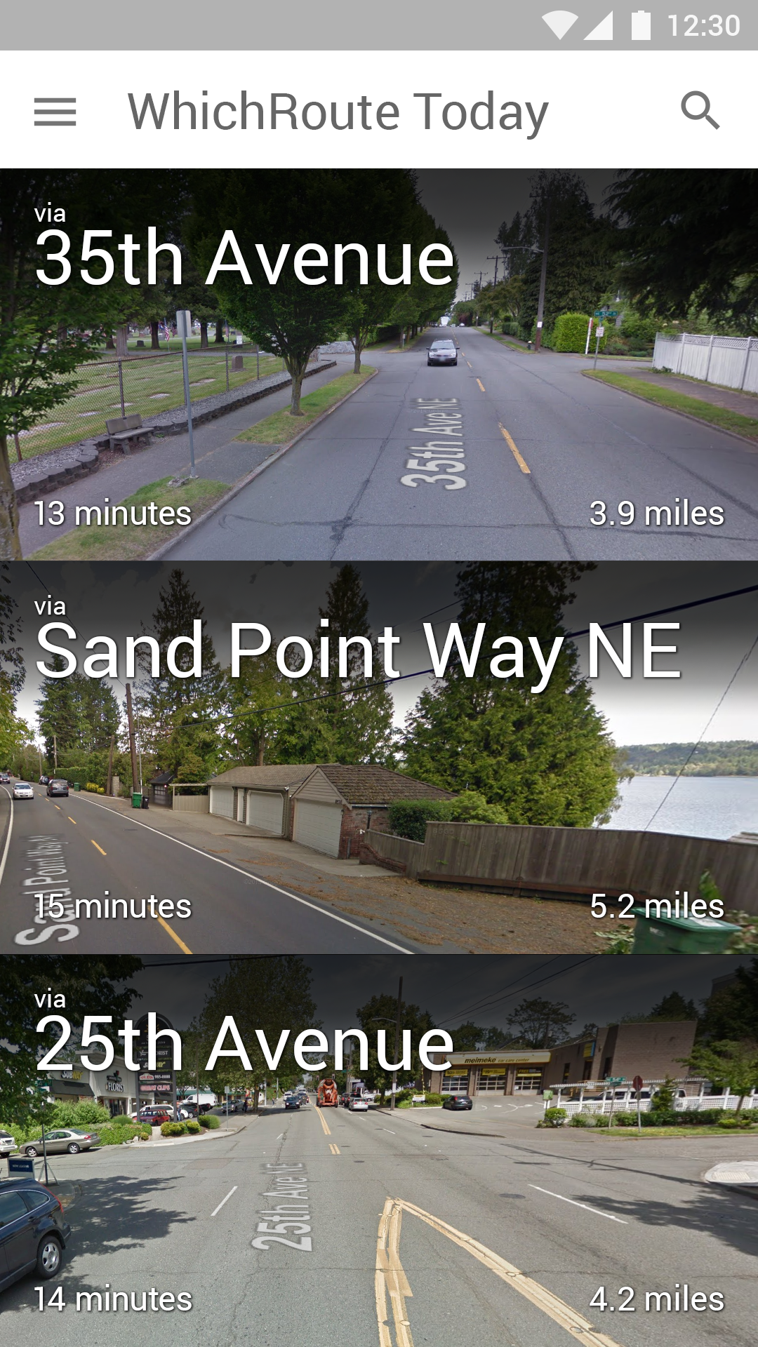
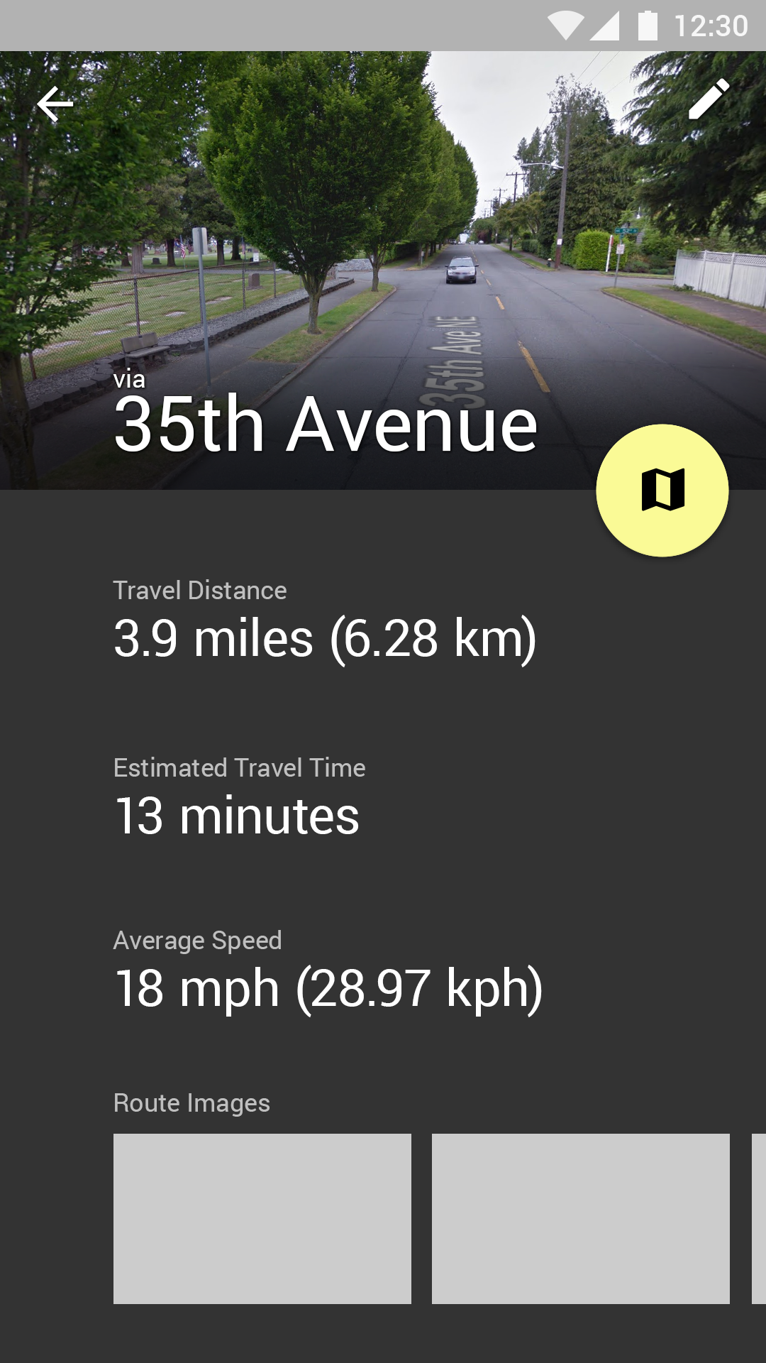
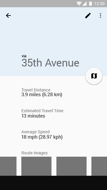
The algorithm that powers WhichRoute balances travel time, physical distance, current traffic (including delays from construction or collisions) and even the path the user most recently took to suggest the route the user will get the most out of, and pulls images of their prospective trips from the web to help illustrate the most scenic parts of each route for qualitative comparison.
The Research
Research has found that almost half of all workers consider their commute to have an impact on their job satisfaction; it follows that unpleasant commutes (due to traffic, road conditions, or simply length) can significantly impact productivity in the form of unhappy employees.
The team at WhichRoute hopes to help minimize that by improving not only the time but the quality of any commute. to that end, I conducted interviews with a number of users who both commute to work in their own car and use map apps such as Google Maps or Waze, looking for pain points and opportunities to provide a more personalized experience.
What I found was that a large segment of users don’t bother engaging map apps for their day-to-day commute because of two things:
- Users generally have a preferred route to commute by, and don’t see a point in opening the app for a drive they know
- Map applications sometimes provide so little extra information on a commute that the interaction costs are viewed as not being worth it
The Concept
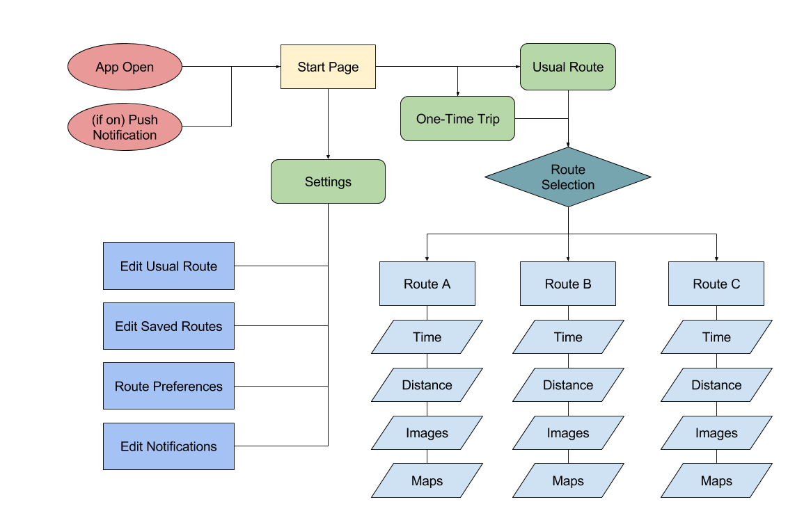
We wanted to add as little extra as possible to our users’ routines, so emphasis was placed on simplicity and minimizing day-to-day cognitive load required to use the app. This meant working around the user’s existing routine, remaining unobtrusive but available at a moment’s notice. Part of what this means is:
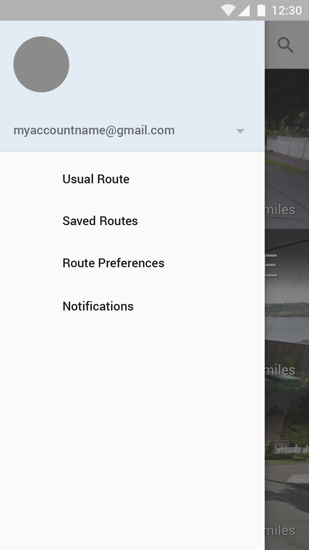
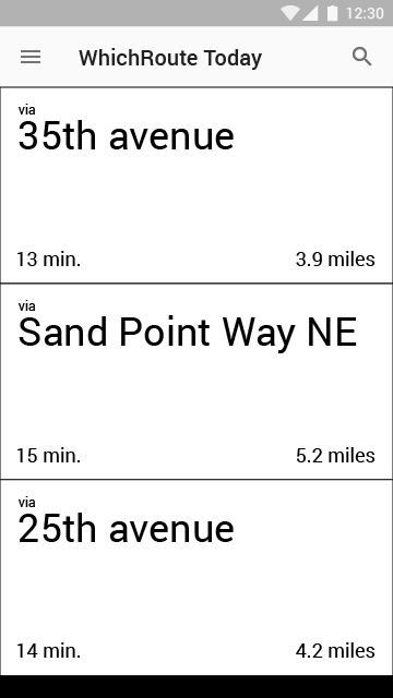
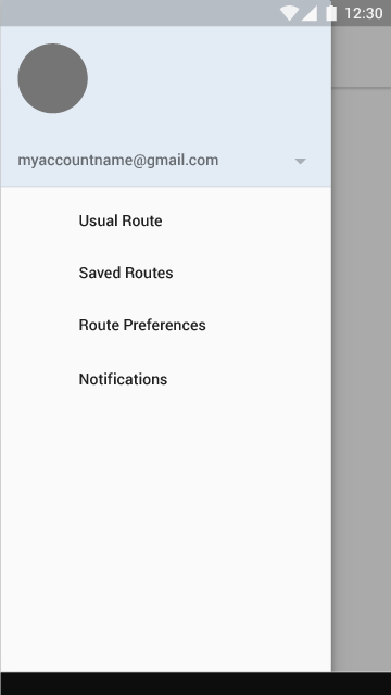
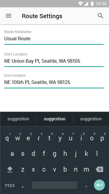
- Often-travelled routes can be saved for easy retrieval, both a “usual” route that is prioritized first and a list of other, less-common trips that can be called up with a touch
- When a user is near a route they have saved (either physically or chronologically) the app sends a push notification to provide seamless entry into the app flow
- The start page immediately jumps to the most likely needs of the user by time and location, but also allows for entry of a different destination quickly and easily
The Architecture
The app’s UI was designed into only a handful of screens, both to minimize download size and to reduce the likelihood of getting lost in the app. Clean, readable type supplies any necessary information, and a muted color palette keeps the pertinent content front and center.
I used Balsamiq Mockups for the initial thumbnails, then moved on to higher-fidelity wireframes made in Adobe Illustrator which were eventually built up into full design comps.
The Branding
Since the idea of making a drive better lies at the core of WhichRoute, we wanted to incorporate visuals reminiscent of cars and/or driving from the very beginning. I was tasked with producing a logo, color palette and typographical guidelines for not only the app, but marketing materials surrounding the product.
The Handoff
For this project, I created color mockups and redline deliverables in Adobe Illustrator for the development team to work from, as well as supplying image assets needed for development and marketing purposes.